


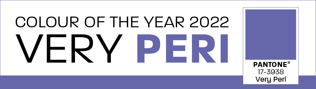
In December of last year, Very Peri was named as the Pantone Colour of the Year 2022. At Glasses Direct, we felt inspired to create our own edit and bring together some stylish frames to help you stay on-trend. Also, we could hardly ignore the similarities between the colour Very Peri and the first name of our multi-talented brand ambassador, Perri Kiely!
PANTONE 17-3938 Very Peri is a particularly vibrant and eye-catching shade that will add a pop of colour to your outfit. It is described as ‘a dynamic periwinkle blue hue with a vivifying violet-red undertone’.
Laurie Pressman, Vice-President of the Pantone Colour Institute said, “We are living in transformative times. PANTONE 17-3938 Very Peri is a symbol of the global zeitgeist of the moment and the transition we are going through. As we emerge from an intense period of isolation our physical and digital lives have merged in new ways.”
This shade is the first to be created for the purpose of Pantone’s educational colour scheme. Previously, colours were chosen from the existing range in the Pantone colour system. Laurie Pressman suggests the development of a new colour “reflects the global innovation and transformation taking place. As society continues to recognise colour as a critical form of communication and as a way to express and affect ideas and emotions and engage and connect, the complexity of this new red-violet-infused blue hue highlights the expansive possibilities that lie before us.”
This colour is unique and inventive, celebrating technology, creativity and innovation at a time when our lifestyles begin to adapt and evolve.
How is the Pantone Colour of the Year selected?
Lots of careful consideration and research are required to decide the Pantone Colour of the Year. The colour experts at Pantone use professional trend analysis to study different aspects of life and new colour influences to see what stands out. They examine current global political and socio-economic climates for guidance. They also conduct thorough research into upcoming films, entertainment, art, fashion, travel, sports and interior design. This extensive research is then used to predict a shade it thinks will be popular in the year ahead.
Why is Pantone’s colour selection important?
Since the first colour was decided in 2000, Pantone has inspired many different brands. The extensive media coverage surrounding this has influenced several industries, from graphic design and social media to fashion and home interiors. Pantone is bringing inspiration to colour lovers everywhere. In fact, when Very Peri was announced, an immersive visual and audio digital experience incorporated rich textures and images of this innovative colour for people to experience at ARTECHOUSE in New York. This was intended to inspire the latest talent in the design and creative industry, allowing people to truly immerse in every aspect of this dynamic colour.
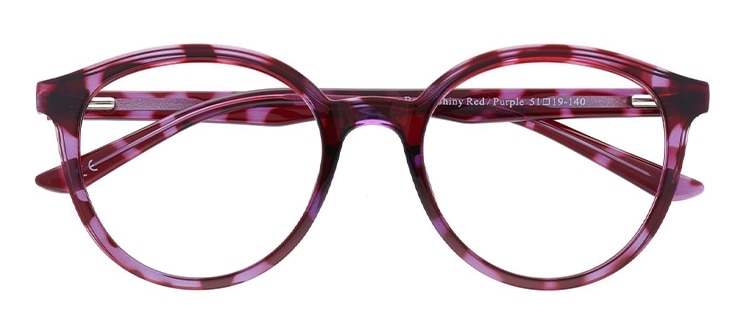
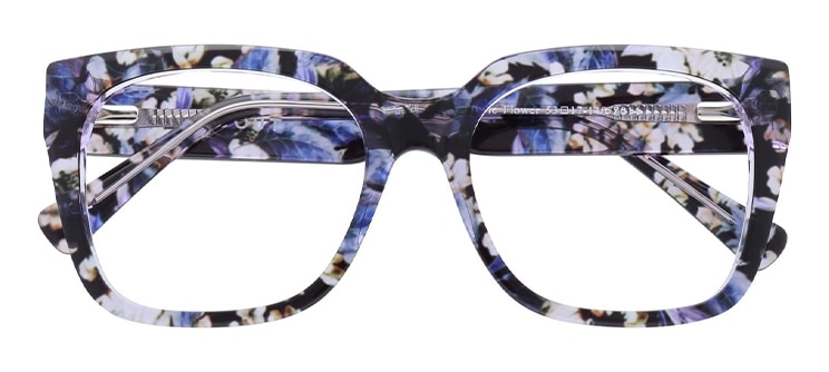
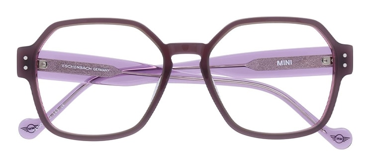
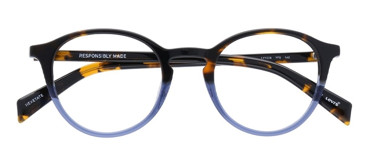
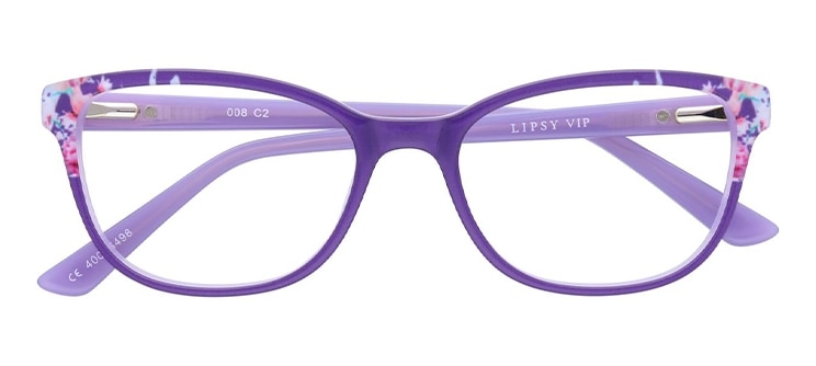
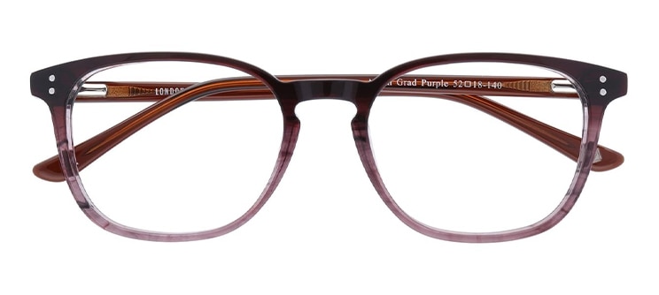
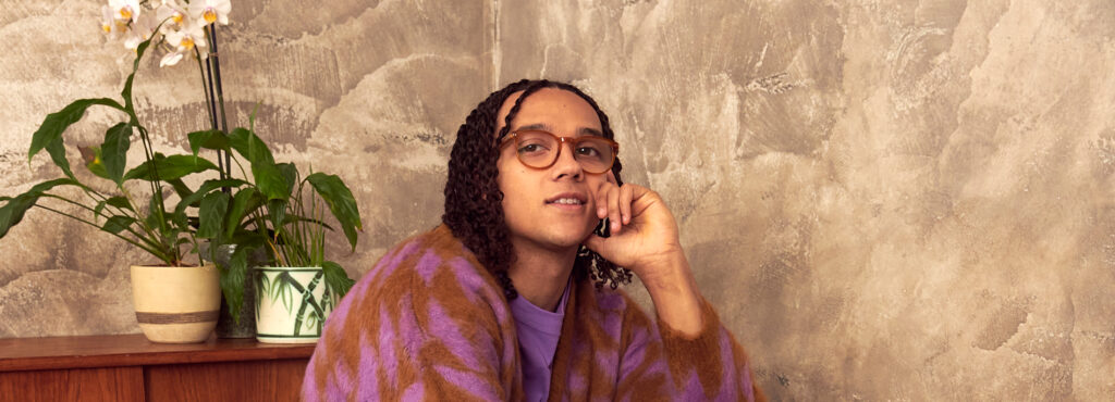
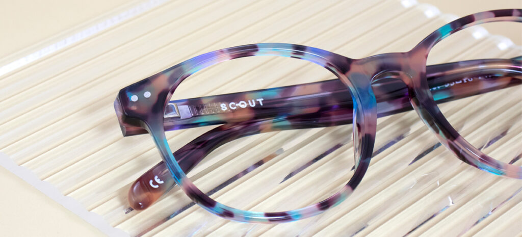
Frames to match the Pantone Colour of the Year 2022
If Very Peri has influenced and inspired your own personal style, then take a look at this collection of fashionable frames. We know that different skin tones and face shapes suit certain styles, so we’ve included a variety of hues from within the blue, red and purple colour family. All of these wonderful shades are themed around this year’s trendy Very Peri colour. Allow these warm and vibrant colours to entice you! Find a style to suit you: