Since the business was founded in 2004, the Glasses Direct website has seen many changes which reflect the evolution of the brand and the business as a whole. In this blog post, we will explore how the Glasses Direct logo has developed over time to appeal to the customer and continue to stay relevant since the start.

2004 to 2008
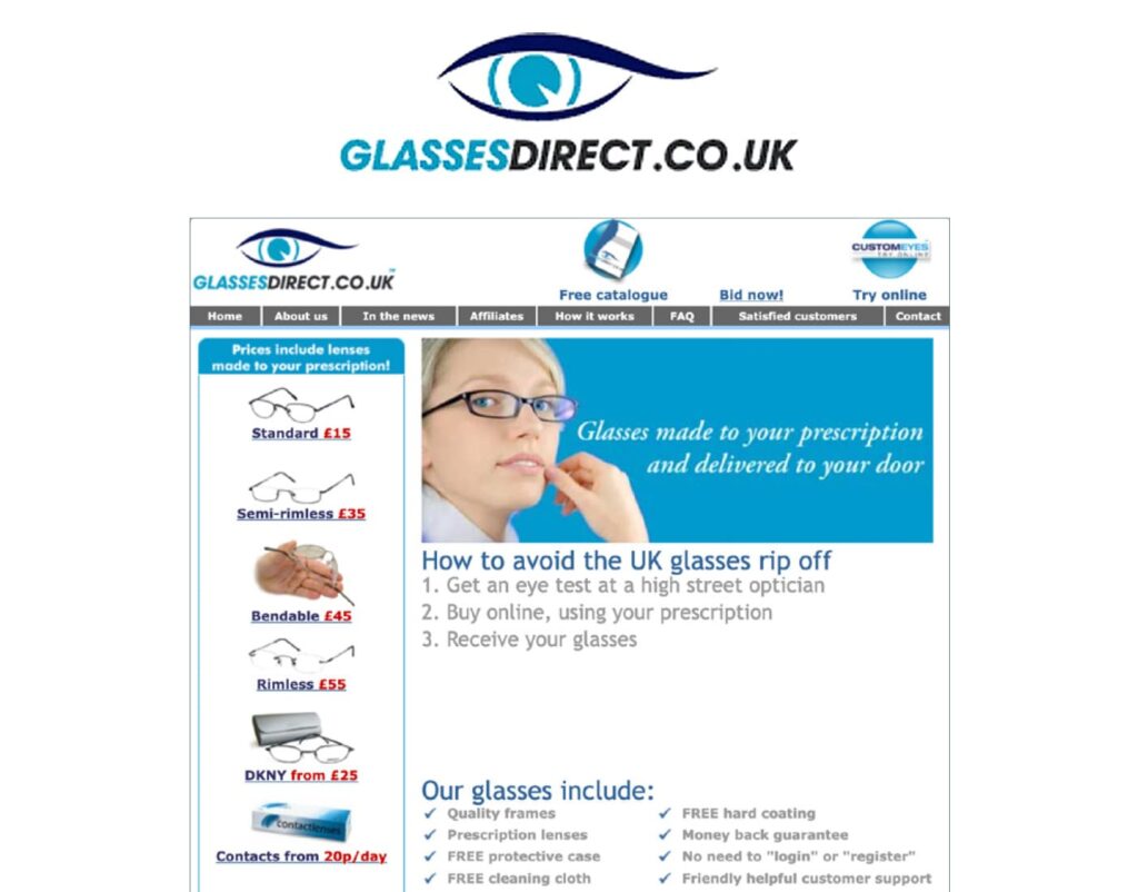
The first logo design for Glasses Direct was very reflective of the time. Glasses Direct celebrated the fact that it was a contemporary online business with the use of ‘.co.uk’ in the logo. The image of the eye above the logo shows that eye care is the top priority for the business. It also firmly established the brand colours of the time, including a light electric blue and a darker ocean blue. The stark contrast of light blue and black lettering highlights and draws attention to the word ‘glasses’, showcasing the main purpose of the brand.
Let’s not forget, the customer shopping experience was a little different back then due to the technology of the time. Whilst customers had the choice to make a secure purchase online, they could also place an order via mail or fax whilst referring to a physical mail-order catalogue. Also, a high amount of Glasses Direct customers were new to buying glasses online so the logo would definitely need to make an impression and have a big impact. It would be responsible for drawing them in at a single glance and directing them where to go online. We’re sure you agree, this design does both very effectively.

2008 to 2014
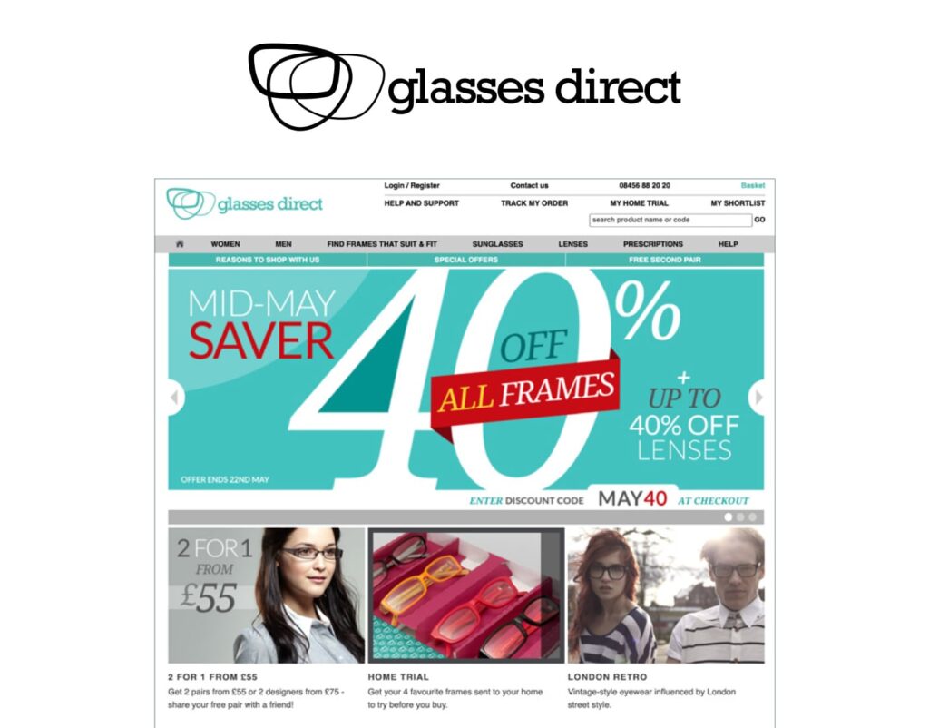
The second Glasses Direct logo appeared in lowercase, giving it a youthful, stand-out edge. It depicts the outline of three lenses which feature before the brand name. As you can see above, the design creates a slightly more contemporary identity for the brand. Throughout its existence on the website, it was displayed in a variety of different formats. There were many adaptations, from the colouring of the logo to its background. This demonstrated a time of experimentation for Glasses Direct as the brand began to establish its identity.
As Glasses Direct began to expand its lens range, the brand logo reflected the vast and varied selection of products available to the customer. Also, at this time, online shopping really started to take off and so the new brand reflected the modernisation of the company website.

2014 to 2020
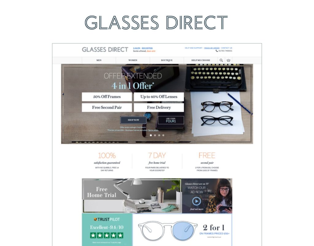
In 2014, in response to the major growth Glasses Direct was experiencing at this time, the website was given a brand-new makeover by the digital agency SomeOne and their sister agency SomeOne/Else. The aim was to make the whole journey and experience more user-centric and enjoyable. The website also began to focus more on mobile sales as more customers turned to online shopping. The aim was to prioritise usability so that customers could benefit from a more immersive shopping experience that was bespoke to them.
This chic and understated logo design reflected the everyday style, quality and value that Glasses Direct offered its customers. Tidy and innovative, it reflected the professionalism of the brand and instilled trust in the customer.
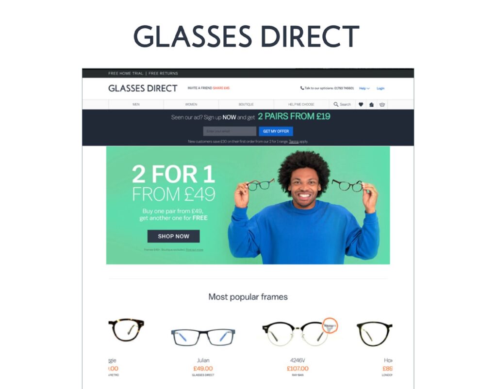
The Glasses Direct logo subtly reminded the customer of the brand whilst drawing their attention to the contemporary design of the website and the seamless shopping experience offered by the company. The logo became slightly bolder in 2017 in order to match the vibrancy of the website.

2020 to present
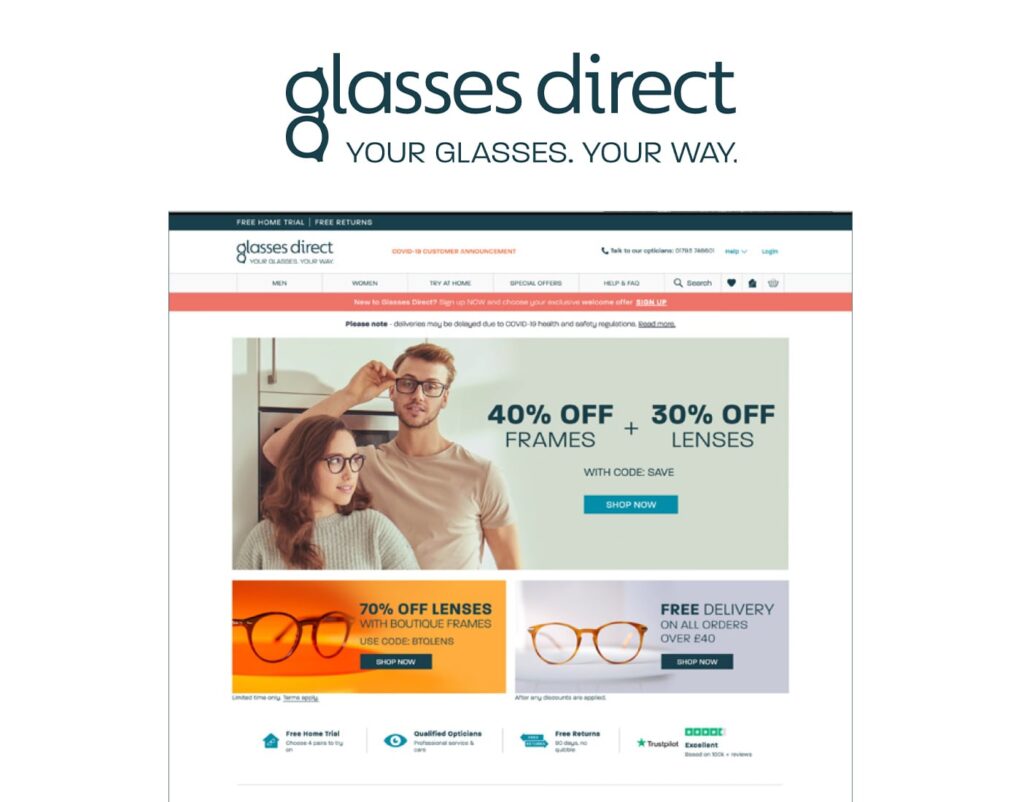
Created by advertising agency Wordley, the current Glasses Direct logo is a fun, playful design that instantly catches the eye. It is unique to the brand and highly recognisable amongst our customers. The letter ‘g’ at the beginning is in the shape of a pair of glasses. The catchy company slogan ‘Your glasses. Your way’ appears in capital letters under the brand name. The slogan reflects the mission of the business to offer great-quality, affordable eyewear for everyone. It shows Glasses Direct’s commitment to customers.
The design is very eye-catching and instantly tells you a lot about the brand straight away. This design is much more in tune with the original logo, demonstrating that Glasses Direct came full circle and is committed to its main mission to offer a personalised and innovative eyewear shopping experience that priorities not only quality but eye health for its customers.

